가끔 일을 하다보면, 레이아웃을 만들고 스타일을 만들다보면, center 맞추기가 짜증이 많이 난다. 왜? 제대로 안맞으니까 ㅜㅜ
horizontal center, vertical center 두가지가 있는데. 정리를 해본다.
Horizontal center
Text는 center 맞추가 간단하다.
text-align: center;
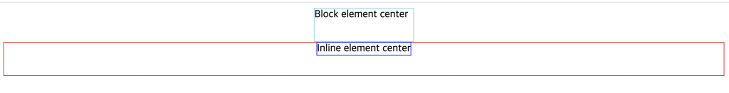
- Block element center – display가 block 라면 가로크기를 지정을 해주고 margin 값으로 0 auto 로 가운데로 정렬 시킬 수 있다.
- Inline element center – display가 block 가 아니고, div로 감싸준 inline의 안에 div를 가운데 정렬을 하고 싶다면, display: inline 또는 inline-block를 지정해주면 가운데로 정렬이 된다.
<!DOCTYPE html>
<html>

<head>
    <style media="screen">
        .block {
            width: 150px;
            margin: 0 auto;
            border:1px solid skyblue;
        }

        .inline-wrap {
            text-align: center;
            border:1px solid red;
        }

        .inline {
            /*display: inline-block;*/
            display: inline;
        }
    </style>
</head>

<body>
    <div class="block">
        Block element center
    </div>
    <div class="inline-wrap">
        <div class="inline">
            Inline element center
        </div>
    </div>
</body>

</html>
Vertical center
이 부분이 제일 짜증나는 부분이다.
position – relative, absolute
display – flex
Position absolute
부모 element 속성이 relative 이고, height로 되어 있어야한다.
body를 가로, 세로 100% 로 지정을 한다음. 부모 div를 relative로 지정후 세로 100% 로 지정 후 자식 div를 absolute, top: 50% 이렇게 하면 가운데 정렬은 되지만 완벽히 텍스트를 가운데로 정렬을 시킬 수는 없지만 transform: translateY(-50%); 로 가운데로 정렬을 시킬 수 있다.
<!DOCTYPE html>
<html>

<head>
    <style media="screen">
        html,
        body {
            padding: 0;
            margin: 0;
            width: 100%;
            height: 100%;
        }

        #relative {
            position: relative;
            height: 100%;
        }

        #center {
            position: absolute;
            top: 50%;
            transform: translateY(-50%);
        }
    </style>
</head>

<body>
    <div id="relative">
        <div id="center">Vertical text</div>
    </div>
</body>

</html>
position absolute를 하면 부모에서 자식의 크기를 알 수 없기에 height를 채워 줄 수 있는 스타일이나 다른 element가 필요 하다.
display flex
최근 flex라는 display가 나왔고 이것을 이용 하면, 바로 적용이 가능하니 참고 하면 된다.
<!DOCTYPE html>
<html>

<head>
    <style media="screen">
        html,
        body {
            padding: 0;
            margin: 0;
            width: 100%;
            height: 100%;
        }

        #relative {
            display: flex;
            height: 100%;
            align-items: center;
        }
    </style>
</head>

<body>
    <div id="relative">
        <div id="center">Vertical text</div>
    </div>
</body>

</html>